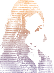
The text altered portrait was fairly easy to follow and complete. I chose one of my favorite poems also it just made it easier to cover with text. I like how instead of just the words you can kind of shade parts of it and it looks like a water color very cool portrait. my only problem was the shadows, and the mid tones, one wasn't really present so it doesn't have as much depth as the tutorial.
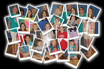
The polaroid portrait took a little longer. I had fun placing and rotating the different polaroids images. It looks a little cluttered I used a picture with too many subjects. But it does look like someone splayed out a bunch of polaroids making a bigger image. I like the way I piled them though some of them i would like to rotate a little. Somethings in the background and others in the foreground. I added a glow to it, to make it stand out a little more from the black, if i could make it a little better i would get rid of the black completely, so its just the polaroids, I like this piece.
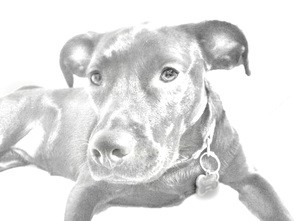
This tutorial I didn't like so much, mostly because of the picture I chose to use for it. The image has too much shading and looks more like a black and white distorted photo, with a filter more than a sketch, not to mention that there isn't much of an outline. The contrast or sharpness of the dog isn't there. The idea of making an image look like a pencil sketch in photoshop seems very difficult, mostly because there is a distinct look that a pencil makes against paper, and a computer changes that because of the pixelation. If I had to do it again I would use a picture of a person with a solid background, and less light interference then maybe the outcome would be different.
 RSS Feed
