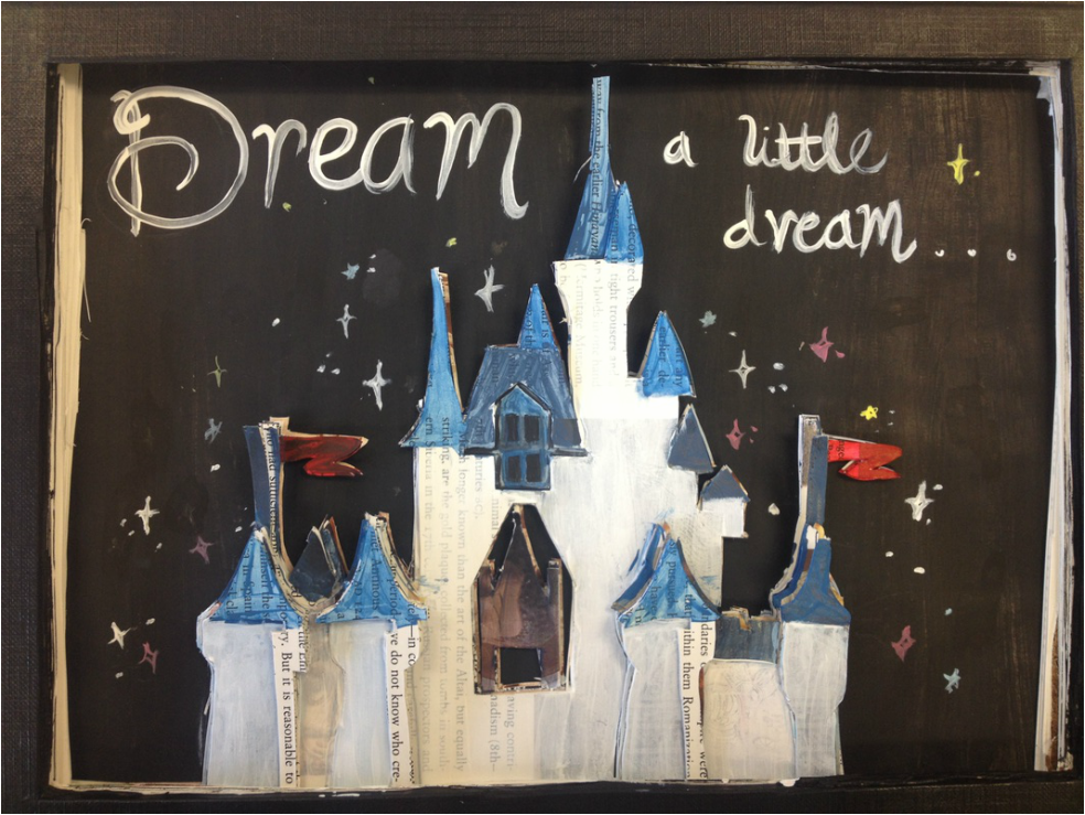
I chose text, or a book, more specifically for this project. I Have done a total of four book carvings, and had enjoyed them, so I chose my final project to be another book carving. This was a mostly pleasure piece, I had just wanted to incorporate something inspired, and since I love Disney , classic Disney, I chose the Cinderella castle. I think the book really emphasizes the castle, and its layered so it is 3D like your imagination becomes when reading books. This piece was definitely a success, and it had come out just as I had pictured if not better.
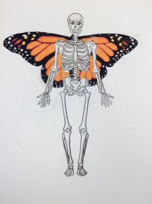
This piece was my first in Art 2, and I think was very successful. I chose to use water color colored pencils, just black, and printed paper for the wings. It was very simple, but was supposed to represent Surrealism, a skeleton with butterfly wings. Like a contrast between beauty and grotesqueness. The plainness and distinctions between the color and vibrancy of the wings versus the dark rigid lines of the Skelton really emphasize my idea or meaning. This piece was a success in my eyes, because it not only looks great but has a deeper meaning to me that when I look at it,, it becomes apparent.
Q3. Through this course, there was a lot more we could have done. I think that mostly if we had a straightforward task or theme of a project we would have more artistic freedom, and organization. For example for all of the words we were given for our visual journal, we should have the same for our projects. Given a theme, and we can interpret and create through our own perspective of the word. I did like how we did gallery walks, they really allowed us to see other people's work and ideas.
 RSS Feed
